How can I center text (horizontally and vertically) inside a div block?
If it is one line of text and/or image, then it is easy to do. Just use:
text-align: center;
vertical-align: middle;
line-height: 90px;       /* The same as your div height */
That's it. If it can be multiple lines, then it is somewhat more complicated. But there are solutions on http://pmob.co.uk/. Look for "vertical align".
Since they tend to be hacks or adding complicated divs... I usually use a table with a single cell to do it... to make it as simple as possible.
Update for 2020:
Unless you need make it work on earlier browsers such as Internet Explorer 10, you can use flexbox. It is widely supported by all current major browsers. Basically, the container needs to be specified as a flex container, together with centering along its main and cross axis:
#container {
  display: flex;
  justify-content: center;
  align-items: center;
}
To specify a fixed width for the child, which is called a "flex item":
#content {
  flex: 0 0 120px;
}
Example: http://jsfiddle.net/2woqsef1/1/
To shrink-wrap the content, it is even simpler: just remove the flex: ... line from the flex item, and it is automatically shrink-wrapped.
Example: http://jsfiddle.net/2woqsef1/2/
The examples above have been tested on major browsers including MS Edge and Internet Explorer 11.
One technical note if you need to customize it: inside of the flex item, since this flex item is not a flex container itself, the old non-flexbox way of CSS works as expected. However, if you add an additional flex item to the current flex container, the two flex items will be horizontally placed. To make them vertically placed, add the flex-direction: column; to the flex container. This is how it works between a flex container and its immediate child elements.
There is an alternative method of doing the centering: by not specifying center for the distribution on the main and cross axis for the flex container, but instead specify margin: auto on the flex item to take up all extra space in all four directions, and the evenly distributed margins will make the flex item centered in all directions. This works except when there are multiple flex items. Also, this technique works on MS Edge but not on Internet Explorer 11.
Update for 2016 / 2017:
It can be more commonly done with transform, and it works well even in older browsers such as Internet Explorer 10 and Internet Explorer 11. It can support multiple lines of text:
position: relative;
top: 50%;
transform: translateY(-50%);
Example: https://jsfiddle.net/wb8u02kL/1/
To shrink-wrap the width:
The solution above used a fixed width for the content area. To use a shrink-wrapped width, use
position: relative;
float: left;
top: 50%;
left: 50%;
transform: translate(-50%, -50%);
Example: https://jsfiddle.net/wb8u02kL/2/
If the support for Internet Explorer 10 is needed, then flexbox won't work and the method above and the line-height method would work. Otherwise, flexbox would do the job.
Centering text vertically and horizontally in a div
Making text central is fairly trivial, the easiest approach is as follows. You can check out the jsFiddle too: https://jsfiddle.net/jL9bs0j7/
.text-container {  height:200px;  width:400px;  border: 1px solid #000;  text-align: center;}
.text-container span {  display: block;  position: relative;  top: 50%;  transform: translateY(-50%);}
<div class="text-container"> <span>Hello World</span></div>How to center text within a DIV vertically and horizontally
Try this:
<div class="bubble">
    <p>blablabla</p>
</div>

.bubble {
  position: absolute;
  background: #cccccc;
  width: 135px;
  height: 84px;
  display: table;
}

.bubble p {
  display: table-cell;
  vertical-align: middle;
  text-align: center;
}
here is a fiddle: http://jsfiddle.net/hLwzymmL/
How to center an element horizontally and vertically
Approach 1 -
transformtranslateX/translateY:Example Here / Full Screen Example
In supported browsers (most of them), you can use
top: 50%/left: 50%in combination withtranslateX(-50%) translateY(-50%)to dynamically vertically/horizontally center the element.
.container { position: absolute; top: 50%; left: 50%; -moz-transform: translateX(-50%) translateY(-50%); -webkit-transform: translateX(-50%) translateY(-50%); transform: translateX(-50%) translateY(-50%);}<div class="container"> <span>I'm vertically/horizontally centered!</span></div>Center a label vertically inside a div
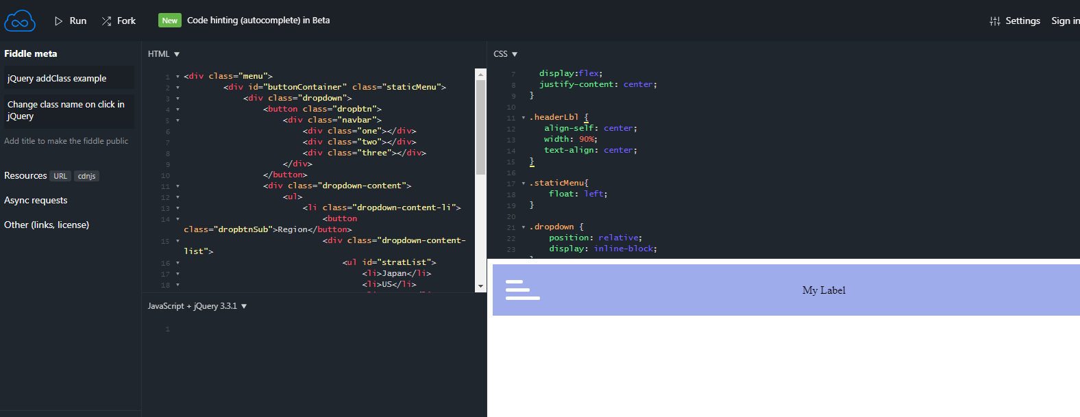
You need to add following styles into your code:
.menu {
  background-color: #9FACEC;    /* Medium blue */
  position: fixed;
  width: 100%;
  margin: 0;
  z-index: 1;
  display:flex;
  justify-content: center;
}

.headerLbl {
   align-self: center;
   width: 90%;
   text-align: center;
}
Center a DIV horizontally and vertically
After trying a lot of things I find a way that works. I share it here if it is useful to anyone. You can see it here working: http://jsbin.com/iquviq/30/edit
.content {
        width: 200px;
        height: 600px;
        background-color: blue;
        position: absolute; /*Can also be `fixed`*/
        left: 0;
        right: 0;
        top: 0;
        bottom: 0;
        margin: auto;
        /*Solves a problem in which the content is being cut when the div is smaller than its' wrapper:*/
        max-width: 100%;
        max-height: 100%;
        overflow: auto;
}
How to vertically center text when using the :before modifier in CSS?
You can use flexbox.
.status-yellow {
    display: inline-block;
    padding: .35em .65em;
    font-size: .75em;
    font-weight: 400;
    line-height: 1;
    color: #000;
    text-align: center;
    white-space: nowrap;
    vertical-align: baseline;
    text-transform: uppercase;
    background-color: #fff;
    display:flex;
    align-items:center;/*for vertical align*/
    justify-content:center;/*for horizontal align*/
}

.status-yellow:before {
        display: inline-block;
        content:"\2022";
        margin-right: 0.5rem;
        color: yellow;
        font-size: 48px;
    }
Vertical align elements displayed as block inside of div
You can do this with display:flex:
.list {  width: 100%;  height: 100%;}
.row {  display: flex;  justify-content: center;  align-items: center;  text-align:center;  width: 100%;  height: 30px;}
.name {  display: block;  float: left;  width: 30%;}
.message {  display: block;  float: left;  width: 70%;}
<div class="list"> <div class="row"> <div class="name">Ben</div> <div class="message">Hello world</div> </div> <div class="row"> <div class="name">Tom</div> <div class="message">Hello world</div> </div> <div class="row"> <div class="name">NoName</div> <div class="message">Hello world</div> </div>Related Topics
How to Remove Hover Effect from Bootstrap Button
On Hover of Child, Change Background Color of Parent Container (Css Only)
Angular Material Table - Apply Dynamically Background Color to a Row (Angular 2+)
Css - How to Make the Checkbox and Label in One Line
Multiple Span Tags Under a Div Add Extra Spaces
How to Style Selected Option Color Separately from Disabled Option
Failed to Load Resource: the Server Responded With a Status of 404 (Not Found) CSS
Browsers Try to Download HTML File Instead of Opening
Limit Number of Digits After Decimals in Text Input
Directory Chooser in HTML Page
Angular 6 Component Not Showing Up
How to Force Div Contents to Stay in One Line With HTML and CSS
Disable Certain Dates from Html5 Datepicker
Change Arrow Colors in Bootstraps Carousel