CSS: split box border color
You need to draw your borders via a gradient eventually: (untill border gradient is avalaible through all major browser ... chrome can do it for ages, FF still not )
.box { height: 100px; width: 100px; padding:3px; background: linear-gradient(to left, red 33.33%, transparent 33.33%, transparent 66.66%, red 66.66%) top left no-repeat, linear-gradient(to left, red 33.33%, transparent 33.33%, transparent 66.66%, red 66.66%) bottom left no-repeat, linear-gradient(to top, green 33.33%, transparent 33.33%, transparent 66.66%, green 66.66%) top left no-repeat, linear-gradient(to top, green 33.33%, transparent 33.33%, transparent 66.66%, green 66.66%)top right no-repeat; background-size: 100% 3px, 100% 3px, 3px 100%, 3px 100%;}<div class="box"></div>CSS: Set a background color which is 50% of the width of the window
Older Browser Support
If older browser support is a must, so you can't go with multiple backgrounds or gradients, you're probably going to want to do something like this on a spare div element:
#background {
    position: fixed;
    top: 0;
    left: 0;
    width: 50%;
    height: 100%;
    background-color: pink;
}
Example: http://jsfiddle.net/PLfLW/1704/
The solution uses an extra fixed div that fills half the screen. Since it's fixed, it will remain in position even when your users scroll. You may have to fiddle with some z-indexes later, to make sure your other elements are above the background div, but it shouldn't be too complex.
If you have issues, just make sure the rest of your content has a z-index higher than the background element and you should be good to go.
Modern Browsers
If newer browsers are your only concern, there are a couple other methods you can use:
Linear Gradient:
This is definitely the easiest solution. You can use a linear-gradient in the background property of the body for a variety of effects.
body {
    height: 100%;
    background: linear-gradient(90deg, #FFC0CB 50%, #00FFFF 50%);
}
This causes a hard cutoff at 50% for each color, so there isn't a "gradient" as the name implies. Try experimenting with the "50%" piece of the style to see the different effects you can achieve.
Example: http://jsfiddle.net/v14m59pq/2/
Multiple Backgrounds with background-size:
You can apply a background color to the html element, and then apply a background-image to the body element and use the background-size property to set it to 50% of the page width. This results in a similar effect, though would really only be used over gradients if you happen to be using an image or two.
html {
    height: 100%;
    background-color: cyan;
}

body {
    height: 100%;
    background-image: url('http://i.imgur.com/9HMnxKs.png');
    background-repeat: repeat-y;
    background-size: 50% auto;
}
Example: http://jsfiddle.net/6vhshyxg/2/
EXTRA NOTE: Notice that both the html and body elements are set to height: 100% in the latter examples. This is to make sure that even if your content is smaller than the page, the background will be at least the height of the user's viewport. Without the explicit height, the background effect will only go down as far as your page content. It's also just a good practice in general.
Splitting background horizontally in half with different colors
You can use linear-gradient():
.box { background: linear-gradient(165deg, #41c7b4 54.5%, #ff7c4a 55%); border-radius: 4px; height: 205px; width: 150px;}<div class="box"></div>fill div with 2 colors?
You can't set multiple background colors, but you could set something like:
div.twocolorish {
    background-color: green;
    border-left: 20px solid red;
}
As long as you don't need text to go over the part in red then this would take care of you in one div.
Split div-box background in three horizontal lines
Try this - I'm sure there's a simpler way, but this gives you the output you want - 3 equal height stripes, vertically centered text and text overlapping the stripes:
#footer { position: relative; height: 99px; background: transparent; color: #282828; margin-bottom: 5em; text-align: center; font-size: 64px;}#footer p { position: relative; top: 50%; transform: translateY(-50%);}#footer .copyright { display: inline-block; padding-top: 0.60em; letter-spacing: 0.05em; color: #999; color: rgba(255, 255, 255, 0.5);}#background { position: absolute; height: 100%; top: 0; right: 0; bottom: 0; left: 0; z-index: -1;}#top,#middle,#bottom { height: 33.3334%;}#top { background: #ff9f65;}#middle { background: #b5b5b5;}#bottom { background: #82c051;}<div id="footer"> <div id="background"> <div id="top"></div> <div id="middle"></div> <div id="bottom"></div> </div> <p>This is my Text here</p></div>Set two different colours to single container
You can do it using gradient but in case you want to create your own Container to get more customization, here you have:
class MyCustomContainer extends StatelessWidget {
  final Color backgroundColor;
  final Color progressColor;
  final double progress;
  final double size;

  const MyCustomContainer({
    Key key,
    this.backgroundColor = Colors.grey,
    this.progressColor = Colors.red,
    @required this.progress,
    @required this.size,
  }) : super(key: key);

  @override
  Widget build(BuildContext context) {
    return ClipRRect(
      borderRadius: BorderRadius.circular(size / 2),
      child: SizedBox(
        height: size,
        width: size,
        child: Stack(
          children: [
            Container(
              color: backgroundColor,
            ),
            Align(
              alignment: Alignment.bottomCenter,
              child: Container(
                height: size * progress,
                color: progressColor,
              ),
            ),
          ],
        ),
      ),
    );
  }
}
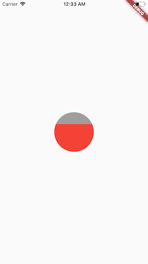
Usage
Center(
        child: MyCustomContainer(
          progress: 0.7,
          size: 100,
          backgroundColor: Colors.grey,
          progressColor: Colors.red,
        ),
      ),
Result
And of course you can customize that widget to receive a child and put it at the center.
Related Topics
Multiple Span Tags Under a Div Add Extra Spaces
Space Between Navbar and the Content
How to Hide an HTML Table Row <Tr> So That It Takes Up No Space
How to Style Selected Option Color Separately from Disabled Option
How to Remove Specific Text With CSS
How to Make My Website Fit Any Screen Size
How to Make Div Have 100% Height of Parent, Independent of Children'S Size? Complex Layout
Placing Two Divs on Top of Each Other Without Using Position:Absolute
How to Change the Time Format (12/24 Hours) of an <Input>
Css Absolute Position With X Scrolling
How to Embed an External Webpage Without Using Iframe
Html/Javascript One Click Print (No Dialogs)
Material Design - Stepper How to Remove/Disable Steps
Force Element to Display Outside of Overflow:Hidden