How can I add a svg as content on :before pseudo element of an element?
Seems like the SVG tag needed more attributes.
#square{ background-color: green; width: 100px; height: 100px;}
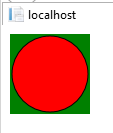
#square:before{ display: block; content: url("data:image/svg+xml;charset=UTF-8, <svg xmlns='http://www.w3.org/2000/svg' version='1.1' height='100' width='100'><circle cx='50' cy='50' r='40' stroke='black' stroke-width='3' fill='red' /></svg>"); background-size: 28px 28px; height: 28px; width: 28px;}<div id="square"></div>Is there a way to use SVG as content in a pseudo element ::before or ::after
Yes you can! Just tested this and it works great, this is awesome!
#test::before {
  content: url(path/to/your.svg);
  width: 200px;
  height: 200px;
}
Or if you prefer to put the SVG directly in the CSS:
#test::before {
  content: url("data:image/svg+xml,%3Csvg xmlns='http://www.w3.org/2000/svg'%3E%3Ccircle cx='100' cy='50' r='40' stroke='black' stroke-width='2' fill='red'/%3E%3Cpolyline points='20,20 40,25 60,40 80,120 120,140 200,180' style='fill:none;stroke:black;stroke-width:3'/%3E%3C/svg%3E ");
  width: 200px;
  height: 200px;
}
<div id="test"></div>Use SVG image inline inside CSS :before pseudo-element
Try this:
div::before {
 content: '';
 background-image: url('data:image/svg+xml;charset=US-ASCII,%3Csvg%20width%3D%22auto%22%20height%3D%2210%22%20viewBox%3D%220%200%2080%2020%22%20xmlns%3D%22http%3A//www.w3.org/2000/svg%22%3E%3Cpath%20d%3D%22M0%200h20L10%2020z%22%20fill%3D%22%23ff0%22/%3E%3Cpath%20d%3D%22M30%2020h20L40%200z%22/%3E%3Cpath%20d%3D%22M60%200h20L70%2020z%22%20fill%3D%22%23ff0%22/%3E%3C/svg%3E');
}
I use http://www.grumpicon.com/ this website to convert SVGs for CSS background
CSS :before on inline SVG
No, inline SVG is treated as an image, and images are replaced elements which are not allowed to have generated content.
Strictly speaking, I think it's undefined. CSS 2.1 just talks about "images, embedded documents and applets" in general and The HTML standard defines it for images, but not SVG explicitly.
IE not displaying SVG as content in a pseudo element :before or :after
I have tested it with IE 11 and I am able to produce the issue. It seems that the pseudo-elements content attribute do not currently work on SVG elements. It can be possible that it is some kind of bug or it is IE browser default behavior. I will try to submit the feedback regarding this issue.
As a workaround, I suggest you display the svg content using background-image attribute, like this:
<style>
    .div1:after {
        content: '';
        display: block;
        height: 80px;
        width: 80px;
        background-image: url(data:image/svg+xml,%3Csvg%20xmlns%3D%22http%3A%2F%2Fwww.w3.org%2F2000%2Fsvg%22%20version%3D%221.1%22%20height%3D%2280%22%20width%3D%22160%22%3E%0D%0A%20%20%3Ccircle%20cx%3D%2240%22%20cy%3D%2240%22%20r%3D%2238%22%20stroke%3D%22black%22%20stroke-width%3D%221%22%20fill%3D%22red%22%20%2F%3E%0D%0A%20%20%3Ccircle%20cx%3D%22120%22%20cy%3D%2240%22%20r%3D%2238%22%20stroke%3D%22black%22%20stroke-width%3D%221%22%20fill%3D%22blue%22%20%2F%3E%0D%0A%3C%2Fsvg%3E);
    }
</style>
<div class="div1" style="background-color:green; width:80px;height:80px"></div>
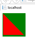
The result in IE 11 browser as below:
Edit:
I am not able to use my svg with background-image property whereas
your svg is loading with the property. Is there any problem with my
svg?
When we use SVG with background-image property, we should ensure that reserved URL characters are encoded (e.g. < === %3C and > === %3E) and also replace the space with '%20'.
So, please encode your svg element as below:
background-image: url(data:image/svg+xml,%3Csvg%20version%3D%221.1%22%20xmlns%3D%22http%3A%2F%2Fwww.w3.org%2F2000%2Fsvg%22%20xmlns%3Axlink%3D%22http%3A%2F%2Fwww.w3.org%2F1999%2Fxlink%22%20preserveAspectRatio%3D%22xMidYMid%20meet%22%20viewBox%3D%22266.53926701570674%20152.66492146596858%2044%2044%22%3E%3Cdefs%3E%3Cpath%20d%3D%22M267.54%20153.66L307.54%20193.66L267.54%20193.66L267.54%20153.66Z%22%20id%3D%22d6AN4MEUYO%22%3E%3C%2Fpath%3E%3C%2Fdefs%3E%3Cg%3E%3Cg%3E%3Cuse%20xlink%3Ahref%3D%22%23d6AN4MEUYO%22%20opacity%3D%221%22%20fill%3D%22red%22%20fill-opacity%3D%221%22%3E%3C%2Fuse%3E%3C%2Fg%3E%3C%2Fg%3E%3C%2Fsvg%3E);
Then, the result like this:
CSS - SVG in a pseudo element with Color changing capabilities
This is easy if you flip the logic - instead of adding color on the hover - think of it as removing color when you are not hovering.
With CSS filters - you can convert your svg to greyscale - meaning that a color image / SVG is rendered as a black and white image. Then on hover - stop the filter / conversion and your svg will have its actual color.
Note that this only works with one color change - you cannot have different paths go different colors etc - but by reversing the color logic you get a black and white svg that turns colorful on hover.
The following div has a border - just to show the dimensions (and I would probably do the svg as the background image of the div rather than the ::before - but I left it as requested. The SVG is iniitally shown as black and on hover over the div - the svg turns red.... magic :)
div {
  height: 160px;
   width: 300px;
   border: solid 1px blue;
   position: relative
}

div::before {
  content: url('data:image/svg+xml;utf8,<svg version="1.1" id="" xmlns="http://www.w3.org/2000/svg" width="100%" height="100%" xmlns:xlink="http://www.w3.org/1999/xlink"  style="" xml:space="preserve"><path d="M150 0 L75 200 L225 200 Z" fill="red"></path></svg>');
  display: block;
    -webkit-filter: grayscale(100);
    filter: grayscale(100);
}


div:hover:before{
    -webkit-filter: grayscale(0);
    filter: grayscale(0);
} <div></div>Add svg to content property
Absolutely, I use this (or rather a variant of it) all the time:
.selected-item:before { content: url("data:image/svg+xml,%3Csvg xmlns='http://www.w3.org/2000/svg' class='whirlocal-pin whirlocal-pin-2' viewBox='0 0 300 400'%3E%3Cdefs%3E%3Cstyle%3E.shape,.swipe-left%7Bfill:%230095ee%7D.shape%7Bfill-rule:evenodd%7D.swipe-right%7Bfill:url(%23linear-gradient)%7D%3C/style%3E%3ClinearGradient id='linear-gradient' x1='187.984' x2='187.984' y2='201' gradientUnits='userSpaceOnUse'%3E%3Cstop offset='0' stop-color='%230350b9'%3E%3C/stop%3E%3Cstop offset='1' stop-color='%230095ee'%3E%3C/stop%3E%3C/linearGradient%3E%3C/defs%3E%3Cpath id='shape' data-name='Outer Pin' class='shape' d='M149.95,400C119.012,320.886,76.928,285.143,45.216,250.9,30.746,235.281,18.435,219.97,10.329,201,3.795,185.7-.008,168.023-0.008,145.882-0.008,65.314,67.131,0,149.95,0S299.908,65.314,299.908,145.882C299.908,255.686,206.386,255.686,149.95,400ZM102.314,98.408c27.056-27.056,70.339-27.64,96.675-1.3s25.752,69.619-1.3,96.675c-24.845,24.845-63.373,27.368-89.9,7.221a66.106,66.106,0,0,1-6.778-5.917C74.675,168.747,75.259,125.464,102.314,98.408Z'%3E%3C/path%3E%3Cpath id='swipe-right' data-name='Outer Pin copy' class='swipe-right' d='M101.053,195.083C74.706,168.747,45.219,96.8,150.013,0H149.95c82.82,0,149.958,65.314,149.958,145.882,0,22.088-3.4,39.848-9.908,55.118l-100.734-.009a71.69,71.69,0,0,0,8.42-7.212c27.055-27.056,27.639-70.339,1.3-96.674s-69.619-25.752-96.675,1.3-27.639,70.339-1.3,96.675c2.152,2.152,2.2,2.152.042,0'%3E%3C/path%3E%3C/svg%3E"); width: 100px; height: 100px; display: block;}<div class="selected-item"></div>Related Topics
Textarea - Disable Resize on X or Y
Is There a Reason to Use Uppercase Letters for Hexadecimal CSS Color Values
Trying to Do a CSS Transition on a Class Change
How to Inspect CSS Pseudo Classes with Firebug
Using Proper CSS Media Queries in Angular
Color "Transparent" Not Working
How to Style Form Drop Down Lists
Sourcemaps with Webpack CSS-Loader
CSS How to Position an Element in a Middle (Half Height/Vertical 50%) of Another Element
How to Detect CSS Inheritance Source
What's The Point of Gutters in CSS Grid Frameworks
Symfony2 - Formbuilder - Add a Class to The Field and Input
Material UI V1 - Set Table Column Widths
Using CSS Text-Overflow to Vary The Number of Lines of Text Within an Element of a Set Height