Speech bubble with arrow
In order to achieve this, you should consider altering your markup in order to make your html more efficient. This can be achieved using a pseudo element. I'll address each point individually, and put it all together at the end of my answer.
First of all,
Use pseudo elements to avoid extra elements
You could use a pseudo element to remove the extra .triangle div. This not only reduces your div numbers, but also helps with positioning as you can use the top: left: right: and bottom: css properties in order to position according to your main element. This can be seen below:
.oneAndOnlyDiv {
  height: 100px;
  width: 200px;
  border: 3px solid gray;
  background: lightgray;
  position: relative;
}
.oneAndOnlyDiv:before {
  content: "";
  position: absolute;
  top: 100%;
  left: 20px;
  width: 0;
  border-top: 20px solid black;
  border-left: 20px solid transparent;
  border-right: 20px solid transparent;
}
<div class="oneAndOnlyDiv">Main div</div>CSS speech bubble with rounded arrow
You could do something like this using transform: skew(); and border-radius. I added z-index: -1 to the pseudo-element so it sits behind the <span> (I'm assuming you will put text inside).
.speech-bubble {    position: relative;    background: #ff0d1e;    display: inline-block;    width: 239px;    height: 95px;    margin: 40px;    -webkit-border-radius: 10px;    -moz-border-radius: 10px;    border-radius: 10px;}
.speech-bubble:after {    content: "";    position: absolute;    top: 25px;    left: -32px;    width: 70px;    height: 30px;    background-color: #ff0d1e;    transform: skew(55deg);    transform-origin: top right;    border-radius: 15% 0 0 0 / 25%;    z-index: -1;}
<span class="speech-bubble"></span>Jetpack Compose create chat bubble with arrow and border/elevation
You can define your custom Shape.
For example you can define a Triangle using:
class TriangleEdgeShape(val offset: Int) : Shape {

    override fun createOutline(
        size: Size,
        layoutDirection: LayoutDirection,
        density: Density
    ): Outline {
        val trianglePath = Path().apply {
            moveTo(x = 0f, y = size.height-offset)
            lineTo(x = 0f, y = size.height)
            lineTo(x = 0f + offset, y = size.height)
        }
        return Outline.Generic(path = trianglePath)
    }
}
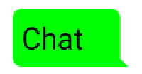
You can also extending the RoundedCornerShape adding the little triangle in the bottom right corner.
Then you can define something like:
Row(Modifier.height(IntrinsicSize.Max)) {
      Column(
          modifier = Modifier.background(
              color = Color.xxx,
              shape = RoundedCornerShape(4.dp,4.dp,0.dp,4.dp)
          ).width(xxxx)
      ) {
          Text("Chat")
      }
      Column(
          modifier = Modifier.background(
                        color = Color.xxx,
                        shape = TriangleEdgeShape(10))
                     .width(8.dp)
                     .fillMaxHeight()
              ){
      }
How to place curved arrow on top of your speech bubble?
You can use a radial-gradient with a transparant circle to create the curved tip of the speech bubble. Apply it to the ::before pseudo element of your bubble so it gets placed on top of your speech bubble div.
.bubble::before {
  content: '';
  height: 30px;
  width: 30px;
  background: radial-gradient(circle at 100% 0, transparent 30px, cornflowerblue 0);
  display: block;
  margin-left: 100px;
}

.message {
  padding: 10px 20px;
  width: 300px;
  background: cornflowerblue;
  display: block;
  font-family: sans-serif;
  color: floralwhite;
  font-size: 18px;
  border-radius: 0 0 10px 10px;
}
<div class="bubble">
<div class="message">
<p>"Tell me and I forget. Teach me and I remember. Involve me and I learn."<p>
<small>Benjamin Franklin</small>
</div>
</div>How to create a speech bubble in which the arrow, or pointer, is part of the element, but the borders that make it are not?
clip-path using a polygon would keep the arrow part within the clickable area.
Here's a very simple example. Obviously the values can be changed to make the exact shape required:
.bubble {
  width: 90vmin;
  height: 40vmin;
  background-color: blue;
  clip-path: polygon(0 5%, 10% 5%, 15% 0, 20% 5%, 100% 5%, 100% 100%, 0 100% );
}
<div class="bubble"></div>create specific chat bubble shape with CSS
Here's a example based on Pure CSS speech bubbles by Nicolas Gallagher.
It uses overlapping pseudo-elements with border-radius to create the bubble's pointy curved stem. This may not be a pixel-perfect match to your mockup, but you can modify the values to improve the shape as desired.
body {
  background: lightgray;
  margin: 0;
}

.speech-bubble {
  position: relative;
  padding: 50px;
  margin: 1em 20px;
  text-align: center;
  color: black;
  background: white;
  border-radius: 30px;
}

.speech-bubble:before {
  content: "";
  position: absolute;
  z-index:-1;
  left: -22px;
  top: 0;
  width: 40px;
  border-bottom: 35px solid white;
  border-top-right-radius: 25px;
}

.speech-bubble:after {
  content: "";
  position: absolute;
  z-index:-1;
  left: -28px;
  top: -3px;
  height: 38px;
  width: 28px;
  background: lightgray;
  border-top-right-radius: 20px;
}
<div class="speech-bubble">Hello, world.</div>Materialize helper text speech-bubble box arrow
Firstly remove the display: inline-block; from your .helper-text::after and add these
display: flex;
align-items: center;
Also margin-top: 10px; would be better than 20px
And for triangle add these to your css file:
input:not([type]).invalid ~ .helper-text::before, input:not([type]):focus.invalid ~ .helper-text::before, input[type=text]:not(.browser-default).invalid ~ .helper-text::before, input[type=text]:not(.browser-default):focus.invalid ~ .helper-text::before, input[type=password]:not(.browser-default).invalid ~ .helper-text::before, input[type=password]:not(.browser-default):focus.invalid ~ .helper-text::before, input[type=email]:not(.browser-default).invalid ~ .helper-text::before, input[type=email]:not(.browser-default):focus.invalid ~ .helper-text::before, input[type=url]:not(.browser-default).invalid ~ .helper-text::before, input[type=url]:not(.browser-default):focus.invalid ~ .helper-text::before, input[type=time]:not(.browser-default).invalid ~ .helper-text::before, input[type=time]:not(.browser-default):focus.invalid ~ .helper-text::before, input[type=date]:not(.browser-default).invalid ~ .helper-text::before, input[type=date]:not(.browser-default):focus.invalid ~ .helper-text::before, input[type=datetime]:not(.browser-default).invalid ~ .helper-text::before, input[type=datetime]:not(.browser-default):focus.invalid ~ .helper-text::before, input[type=datetime-local]:not(.browser-default).invalid ~ .helper-text::before, input[type=datetime-local]:not(.browser-default):focus.invalid ~ .helper-text::before, input[type=tel]:not(.browser-default).invalid ~ .helper-text::before, input[type=tel]:not(.browser-default):focus.invalid ~ .helper-text::before, input[type=number]:not(.browser-default).invalid ~ .helper-text::before, input[type=number]:not(.browser-default):focus.invalid ~ .helper-text::before, input[type=search]:not(.browser-default).invalid ~ .helper-text::before, input[type=search]:not(.browser-default):focus.invalid ~ .helper-text::before, textarea.materialize-textarea.invalid ~ .helper-text::before, textarea.materialize-textarea:focus.invalid ~ .helper-text::before, .select-wrapper.invalid ~ .helper-text:before {
      content: "";
      position: absolute;
      left: 10px;
      bottom: 100%;
      width: 0;
      height: 0;
      border-style: solid;
      border-width: 0 7px 7px 7px;
      border-color: transparent transparent #ee3224 transparent;
      transform: translateY(1px);
    }
Speech bubble background for arrow as well
Here is the question answered elsewhere
Creating a transparent arrow above image in CSS3
But, I'll give you the HTML and CSS for your specific answer. I changed your HTML a little bit by the way.
<div class="bubble">
    <img class="test" src="http://placekitten.com/241/310" alt="kitten" />
</div>
You can keep it with just the div .bubble and have background: url('http://placekitten.com/241/310'); but the image would have to be exactly the height and width of the div.
.bubble {
    position:relative;
    width:241px;
    height: 310px;
}
.bubble:before, .bubble:after {
    content:'';
    position:absolute;
    width:0;
    border-left:15px solid white;
    left:0;
}
.bubble:before {
    top:0;
    height:128px;
    border-bottom:15px solid transparent;
}
.bubble:after {
    top:143px;
    bottom:0;
    border-top:15px solid transparent;
}
.test {
    display:block;
    width:100%;
}
Here is a fiddle http://jsfiddle.net/WUXQd/2/ the fiddle has comments in it explaining a bit how it works.
EDIT: By the way this creates a mask around the image and two reverse triangles to make it look like there is a transparent triangle.
Related Topics
Stretch Child Div Height to Fill Parent That Has Dynamic Height
Want My Button to Remain Dark When Clicked
Canvas Is Stretched When Using CSS But Normal With "Width"/"Height" Properties
Single Huge .Css File Vs. Multiple Smaller Specific .Css Files
How Are the Points in CSS Specificity Calculated
Css Display: Inline VS Inline-Block
Border-Radius in Percentage (%) and Pixels (Px) or Em
Fixed Position But Relative to Container
Css - How to Overflow from Div to Full Width of Screen
Responsive CSS Background Images
How to Suppress Spacing Between Paragraphs of the Same CSS Class
Bootstrap 4 - Change Position of Carousel Controls
Font Awesome Not Working, Icons Showing as Squares
What Are the Differences Between Flex-Basis and Width
Custom CSS Scrollbar For Firefox
Stopping a Css3 Animation on Last Frame
How to Vertically Center ≪Div≫ Inside the Parent Element With Css